From Heavy Metal, volume III, number 6 (October 1979), here is Alberto Breccia’s adaptation of H.P. Lovecraft’s “The Dunwich Horror”:
[UPDATE: The version published in Heavy Metal is now followed by a scan of the Spanish-language original, which provides the ocular proof of HM’s legendary translation and relettering butchery — not to mention HM’s failure to give credit to Breccia collaborator Norberto Buscaglia!]
[CLICK EACH IMAGE TO ENLARGE, or RIGHT CLICK > SAVE LINK AS…]
Alberto Breccia (1919–1993) was a 2009 Will Eisner Comic Industry Hall of Fame nominee. That Breccia was passed over for the award says considerably more about the shameful lack of availability of English translations of Breccia’s comics than it does about the quality of the work, which was first-rate.
The artists who were named to the Will Eisner Comic Industry Hall of Fame for 2009: Harold Gray, Graham Ingalls, Matt Baker, Reed Crandall, and Russ Heath. Ah nostalgia… there’s no soporific like it…

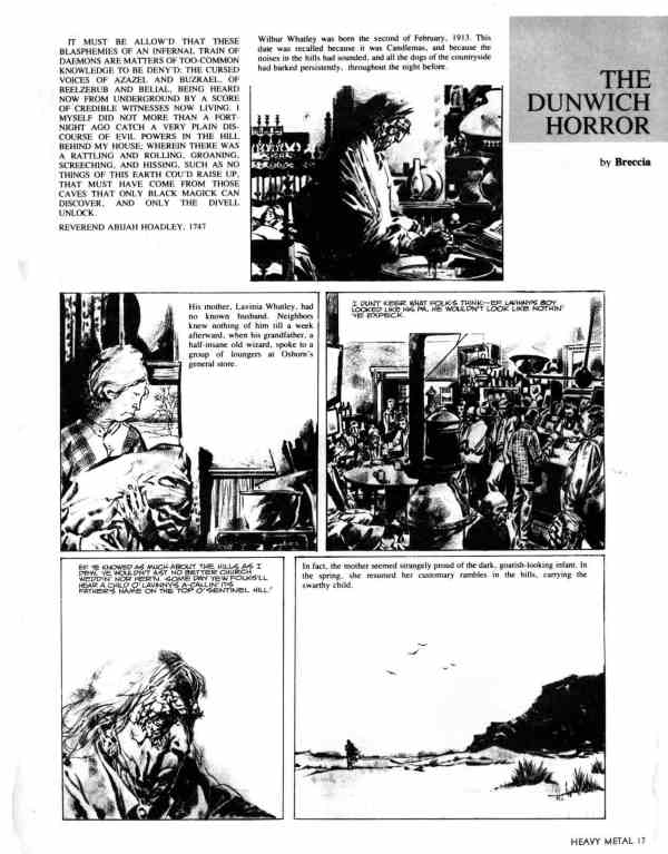
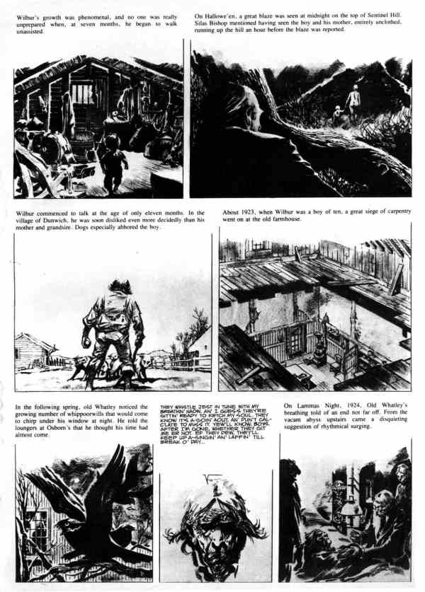


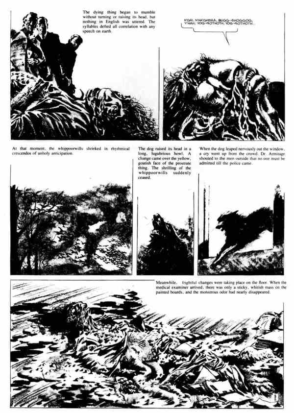
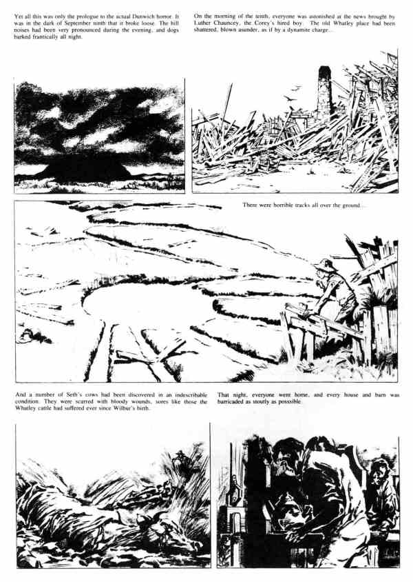
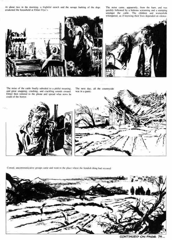
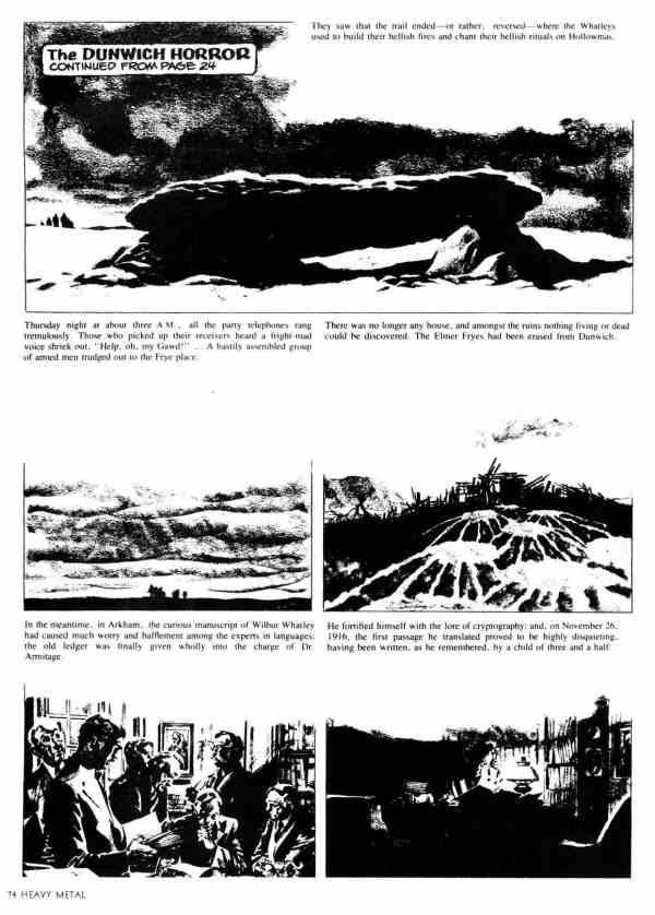
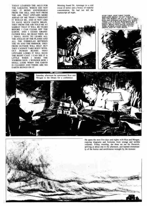

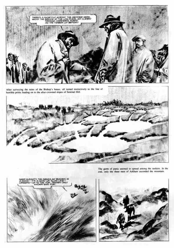

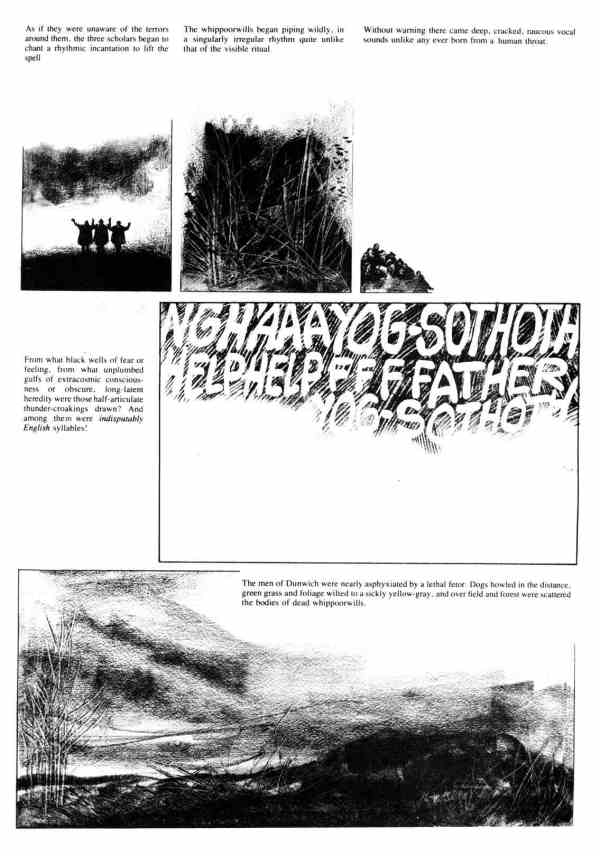
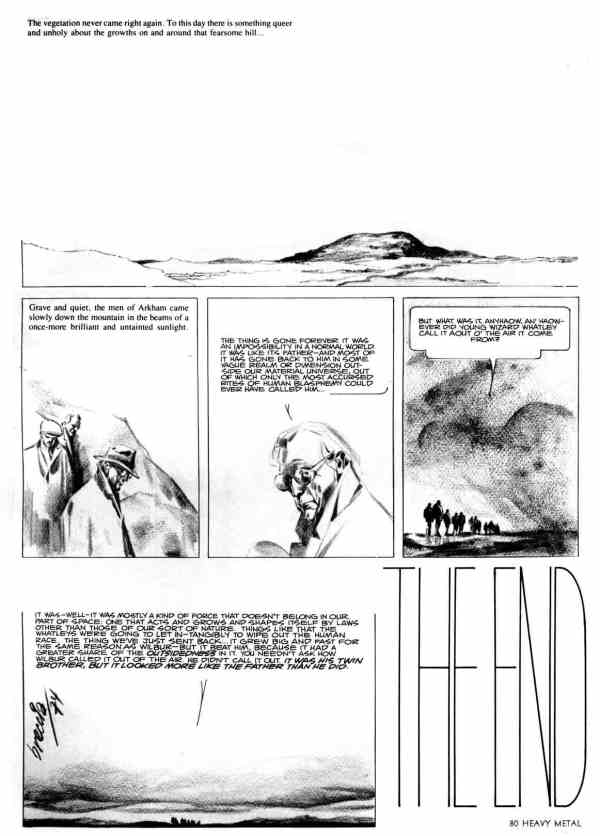
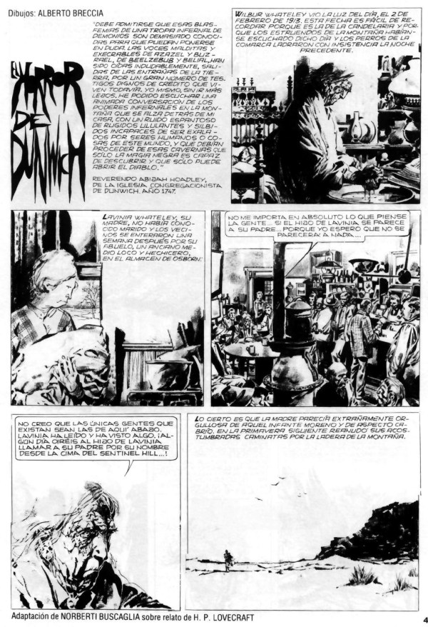

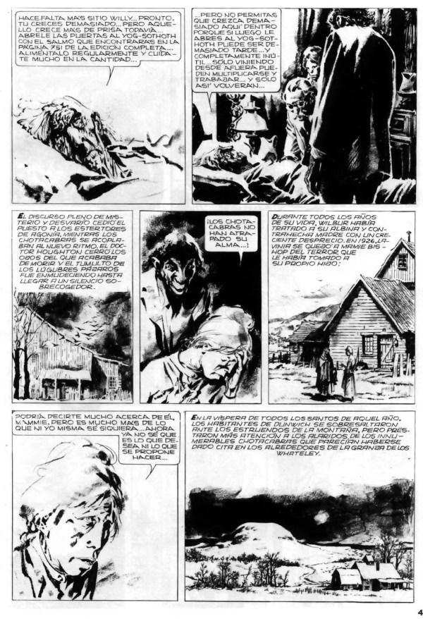

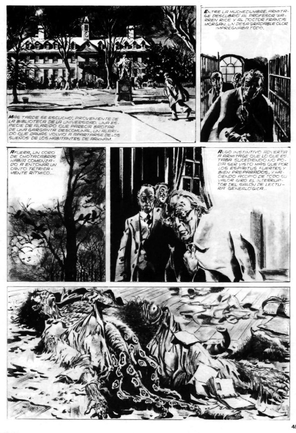
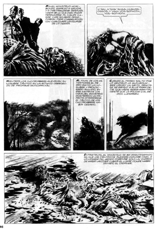
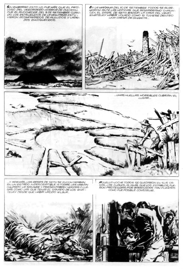
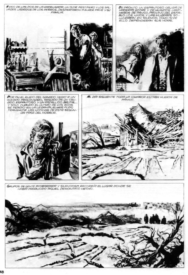

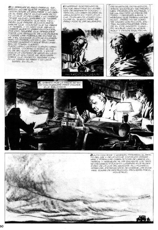


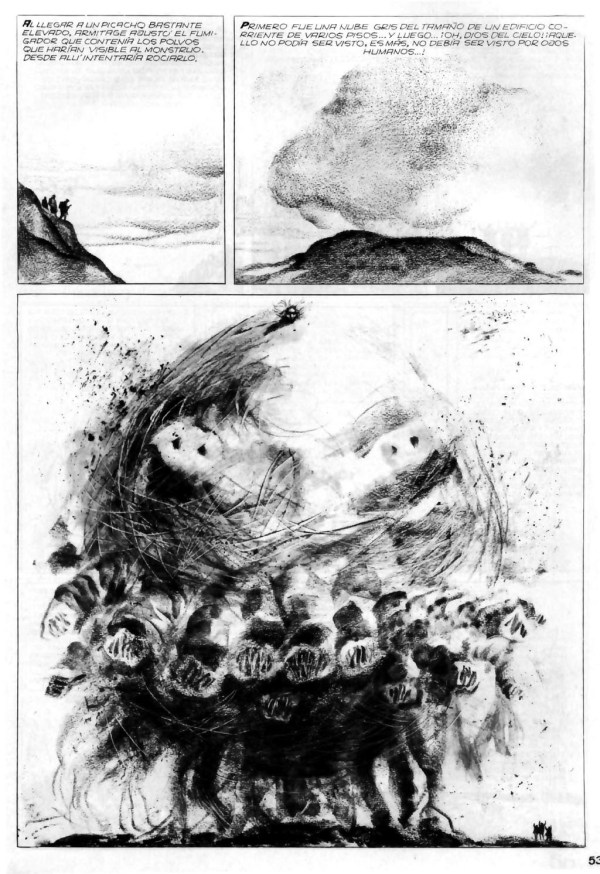


Alberto Breccia was quite a master, and his use of design is superb! Haven’t read the story yet, so can’t comment on his storytelling. At a glance, it seems to rely too much on jump cuts, probably due to the scripting, rather than any recognisable panel sequences. Impeccable drawing, though! He lived a long life, and his son Enrique is in the business, too.
LikeLike
Post again after you’ve read it. I think you’ll be pleasantly surprised how effective it is. Unfortunately, the typesetting and hand lettering leave a lot to be desired, but I think one has to blame Heavy Metal for that, not Breccia. In fact, the hand lettering looks to me like it was done by HM art director John Workman, who had a distinctive and much-admired lettering style, but who (if it is him) sometimes packs the words and lines a little too closely together for my taste. The readability of the text is also impeded, in my view, by the use of fully justified blocks of type. In the narrow confines of a comics panel, full justification tends to leave varying amounts white space between the words in successive lines when what readers need is for the white space to be the same in every instance so that it disappears into the background. Finally, I have a sinking feeling that HM did the re-lettering on pieces of paper that were then cut out and pasted onto stats of the artwork without regard for Breccia’s panel and balloon borders.
So now I’m off to search for a scan of the Spanish language original… because I smell a rat!
LikeLike
Okay, a scan of the original Spanish-language version was a lot easier to find than I thought it would be, so expect an update in the next couple of minutes…
LikeLike
What’s amazing to me is that the extent of HM’s in-house butchery is actually worse than I imagined!
LikeLike
Hello,
An extensive bibliography of Alberto Breccia, including English speaking titles published in Great Britain and USA, is available at :
http://www.albertobreccia-bibliografia.com/
Rotomago
LikeLike
Cool.
LikeLike