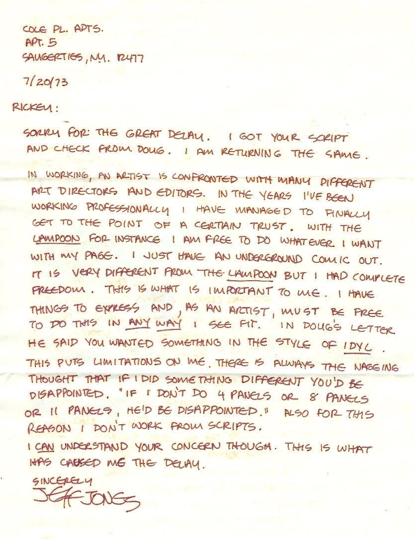
My apologies in advance to a certain frequent visitor to this blog who is tired of my ongoing series of posts featuring the art of Jeffrey Jones, but I rescued these zine cover scans from three auctions that ended yesterday, and just had to share them:

In a promotional clip for the forthcoming documentary, Better Things: Life + Choices of Jeffrey Jones, that used to be available for viewing on the documentary’s official Web site, Michael Kaluta talked about the galvanizing impact the painting that appeared on the cover for Trumpet #8 had on him and his friends, but it looks like a fairly routine student effort to me. I guess you had to be there…

Facebook Tumblr Twitter Email
 

From the growing vintage paperback library of yours truly, here are two novels of “occult Evil” by Peter Saxon, with cover art by Jeffrey Jones:

Very, very nice.

Facebook Tumblr Twitter Email
 

Yesterday, I won an ebay auction for 12 items with art by Jeffrey Jones, some of which I already own, but the majority of which I don’t. Here’s the list that was provided by the seller, followed by the auction images (although, of course, I intend to post better scans once I have the items in hand):

8 paperback books with Jeffrey Jones cover paintings

The Planet Wizard by John Jakes
Day of Beasts by John Muller
The Dirdir by Jack Vance
Swords in the Mist by Fritz Leiber
Dark Planet by Hunter
Uncharted Stars by Andre Norton
Sargasso of Space by Andre Norton
Nine Princes in Amber by Roger Zelazny

The paperbacks vary in condition. Most are decent. Some have surface wear, and corner bumps. [....]

The two tabloid issues of ART SHOW from 1977 and 1978. #1 has Jones art inside and #2 has the DARK MANSION OF FORBIDDEN LOVE cover printed from the original art. This is what the painting actually looks like. The color was added photographically for the printed comic book.

Jeff Jones postcard from a privately printed set from around 1974 which included Frank Frazetta, STEVE HARPER, Mike Nally, and Norman Lindsay.

COLOUR YOUR DREAMS — with Jones covers and one image inside. Also inside are drawings by Kaluta, Wrightson (a very early Frankenstein piece), Barry Smith, Fujitake, Dave Cochrum, Roy Krenkel, and others. Nice portfolio — 32 pages. Published in 1972.

YOU NEED NOT BOTHER CLICKING THE IMAGES BELOW;
THEY’RE ALREADY DISPLAYED AT FULL SIZE.
WHAT YOU SEE IS WHAT YOU GET.

Regular visitors to RCN may recall that I already own and have posted scans of four out of eight of the paperbacks pictured above; the other four, however, will be new to this site, assuming they are in good enough condition to produce a decent scan. But that being said, the main reason I bid on the lot is to get the postcard, the two issues of Art Show, and the Colour Your Dreams portfolio publication.

All of which is to say: Jones fans, you have something to look forward to here at RCN in a couple of weeks!

Facebook Tumblr Twitter Email
 

A handful of photographs and preparatory sketches are all that is left of Klimt’s controversial “Faculty Paintings.” All three — Philosophy (1900), Medicine (1901), and Jurisprudence (1903) — were destroyed in May 1945 when the retreating Nazis, who had illegally seized Klimt’s paintings from their legitimate owners, set fire to Schloss Immendorf, a castle in Lower Austria to which the paintings had been transported in 1943 for safe keeping.

P.S. The reason I’ve included the photo of Jurisprudence is simply to complete Klimt’s triptych for those who haven’t seen it. It’s not because I think it had a particular influence on the paintings by Jones included above.

P.P.S. Yes, I am aware that there are several other Klimt-inspired paintings by Jones. Maybe another time…

Facebook Tumblr Twitter Email
 

From Boris Karloff: Tales of Mystery #21, here — more for the sake of historical interest than for its intrinsic merit, which is slight — is “The Screaming Skull,” with art by Jeffrey Jones:

Published in March 1968, “The Screaming Skull” must have been among the first freelance jobs that Jeffrey Jones landed after he moved, with his wife and daughter, to New York in the winter of 1967 to look for work as an artist, and frankly, Jones’s inexperience shows. But keep in mind…

“Beginnings are always messy” — John Galsworthy

“There are two mistakes one can make along the road to truth — not going all the way, and not starting.” — Gautama Buddha

Facebook Tumblr Twitter Email
 

Back in 2009, art collector and big-time Jeffrey Jones fan, Rob Pistella, generously invited me to use scans from his Comic Art Fans gallery on RCN. The first item I highlighted was a letter by Jeffrey Jones dated 7-20-73. The second is right here:

Facebook Tumblr Twitter Email
 

From Marvel Fanfare #8 (May 1983), “The Bill Sienkiewicz Portfolio,” coloured by Christie Scheele:

Notice Sienkiewicz’s Jeffrey Jones-inspired signature. Not really any evidence of Jones’s influence in the drawing, however. Ralph Steadman, maybe. Bob Peak, definitely — especially in the Thor image, but in some of the others as well. Neal Adams, definitely — all over the place. Jones, not so much.

To my eye, at least.

For one thing, Sienkiewicz’s figures are just not specific enough. They’re not carefully observed. There are no details that make you think, yes, that’s how a body really looks, and yes, that’s how it moves! Jones’s best drawings are filled with such details.

Seven years later, Sienkiewicz was hard at work on the artwork for Big Numbers, where he combined a loose mixed-media illustrative technique with extensive photo reference. Here’s a random sample from issue #1, as featured on Bill Sienkiewicz’s official Web site (where the style is explicitly identified as “photo-realistic”):

And here’s another:

It was a relatively original synthesis of the influences that Sienkiewicz had formerly worn on his sleeve, but still — to my eye — Sienkiewicz’s Big Numbers style owed more to work such as Richard Diebenkorn’s mixed-media figure drawings (see, for instance, Diebenkorn’s Seated Woman No. 44 [1966] posted below) — along with a certain highly influential school of heavily photo-referenced but painterly illustration art that emerged in the 1960s and steamrolled into the 1970s and beyond (Bernie Fuchs comes to mind here; and Robert Heindel) — than it ever did to Jones’s Idyl or I’m Age strips.

Nor did Sienkiewicz’s work have to resemble Jones’s, for Sienkiewicz to claim Jones as an influence.

Because the simple fact is, one can be influenced by a fellow artist’s example of artistic independence, integrity, and experimentation without latching on to specific aspects of his or her style…

BONUS IMAGE:

From 1988, a page from Stray Toasters, to compare with the illustration by Robert Heindel that I linked to earlier:

Facebook Tumblr Twitter Email
 

Here’s another justly forgotten Lin Carter novel, half of an “Ace Double,” with cover art mistakenly credited on the verso of the title page to Kelly Freas even though the art is clearly signed “Jones”:

jeffrey-jones_tower-of-the-medusa_ny-ace-1969

ABOVE: Lin Carter, Tower of the Medusa (New York: Ace, 1969), with cover art by Jeffrey Jones.

Facebook Tumblr Twitter Email
© 2012 Ragged Claws Network Suffusion theme by Sayontan Sinha